The Baked Batch.

The Baked Batch delivers freshly-baked, New York style cookies straight to your doorstep. We were tasked with branding their initial website release. This included logo design, colour palettes, product photography, typography and copy, and more.

The colour scheme plays on the warm and inviting nature of their product. Rich, earthy tones of red, brown and orange and laid on thick. This contrasts nicely against a steely blue. Textured with aged paper, we wanted to convey a handcrafted, rough-around-the-edges vibe these cookies ooze. We incorporated some retro, psychedelic typography for the logo to really drive home the old-school appeal.

Thick. Gooey. Goodness.

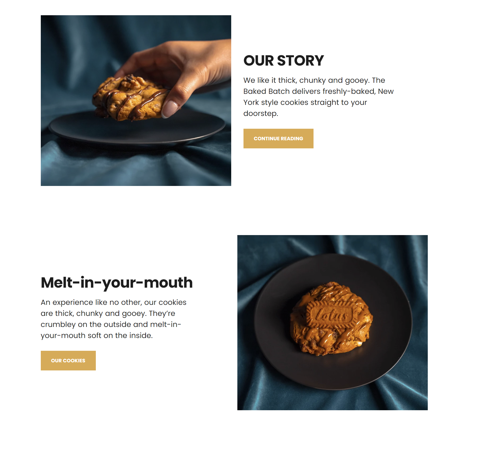
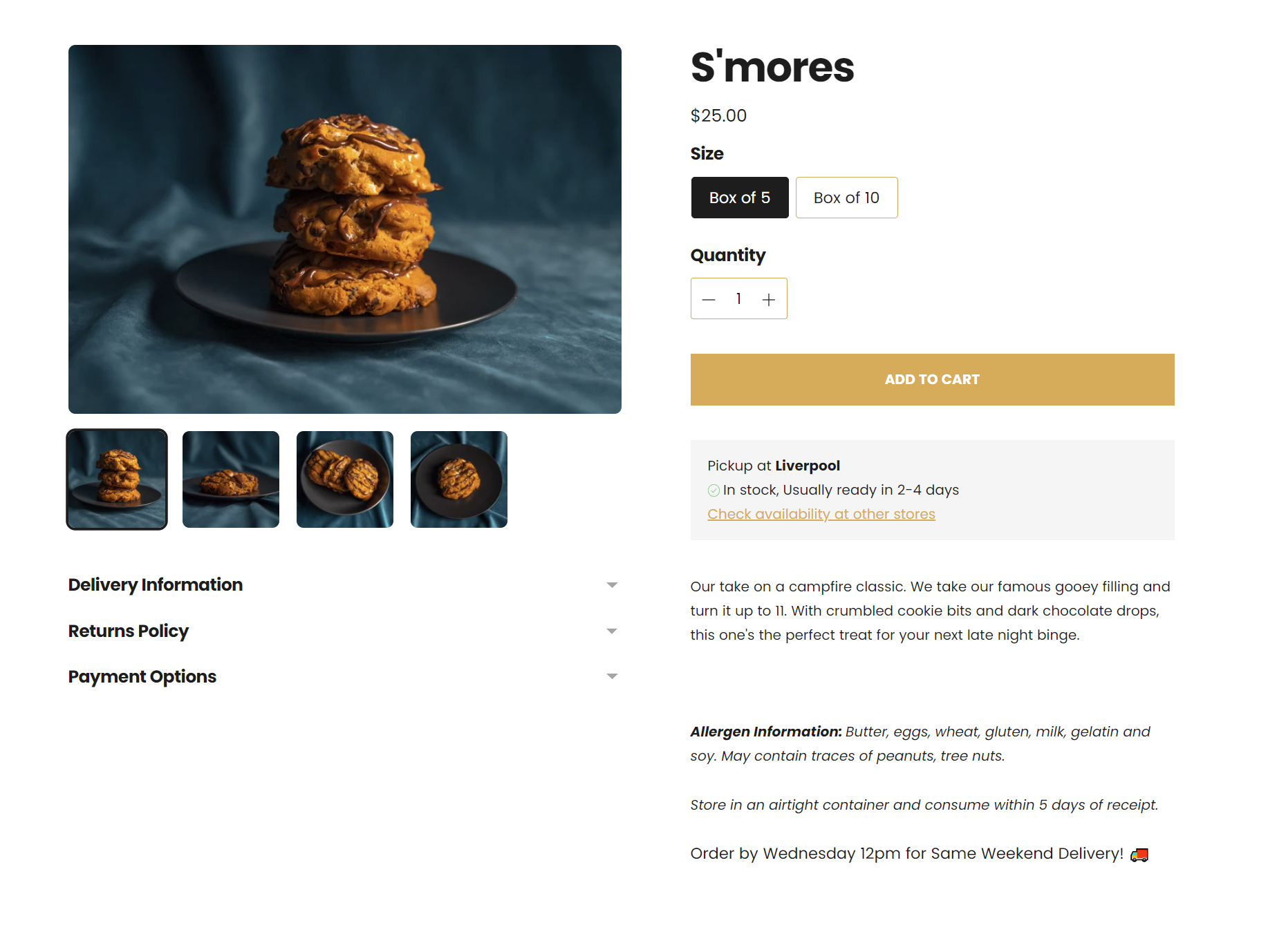
An experience like no other, their cookies are thick, chunky and gooey. They’re crumbly on the outside and melt-in-your-mouth soft on the inside. We wanted to encapsulate how delectable their products are by shooting beautifully soft product photography. With gentle roll-off in the shadows, glossy specular highlights on the drizzle and a luxurious velvet blue backdrop that makes that warm orange cookie *pop*, our client was stoked with the results.

We kept product descriptions and website copy light-hearted and fun.

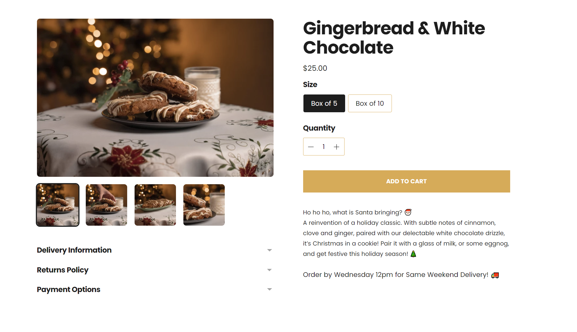
Evoking memories of campfires and festive celebrations, the copy had to emphasise the experiential, nostalgic quality of the cookies. This complemented the retro feel to the branding, but also put helped in describing the point of difference in the product.

Descriptions like “thick, chunky, and gooey” and “melt-in-your-mouth”, paired with the decadent and dramatic product photography makes it clear - this is not your average cookie.

We also threw in a couple of hidden pop culture references for fun. Bonus points if you can guess what they are!

Previous
Previous

Blu Note Espresso

Next
Next

Dr Vince Polito